Have you ever looked at a book in the aisles of your favourite bookstore in the city and fallen in love at first sight? The colours or lack thereof (whatever you’re into) spoke to you, whispered treasured secrets, beckoned you to look for more. Have you ever stood in front of a shelf, gazing upon a book cover that hypnotised your soul? And even though you didn’t have another penny to spare, you couldn’t part with the whirlwind romance that was promised by the cover.
According to our cover designer, Ishita, that’s what it is, a promise. When I asked her which famous book cover she would like to redesign, she said it would be The Great Gatsby. That’s how this author got to be sure that she likes a challenge, and if I know The Great Gatsby, I know it’s the handbook for us romantics at heart.
Now, however many romantic ideas a book cover may plant into your head, how it comes to be might be a little less romantic. Yes, we’ve all read a book and instantly gotten an idea of how it should look, especially visual learners (I know you’re out there).
But is that what it is? Pulling an all-nighter, reading the entire manuscript and a stroke of genius? Sana and Ishita would both disagree. Ishita says in her pro cover-designer tone,
The first things I look for are the overall mood and theme of the book. I try to understand what kind of feeling the cover should create when someone sees it for the first time- whether it’s suspenseful, emotional, mysterious, adventurous, or something else. I also pay attention to the genre and any key visual elements suggested by the title or marketing brief. These details help me build a clear direction before I start thinking about specific imagery, colours, or typography.
Sana, the Head of Creative Decisions and the ultimate authority on all artwork at Zeba Books, sees the process less as spontaneous inspiration and more as an act of interpretation.
Creating a book cover is a different form of art. It is not something you create randomly. You should draw something that relates to the book’s storyline, connects with the audience instantly, and attracts attention
For Sana, the story itself determines the visual language.
When I start designing the cover, the first thing that comes to mind is how the book’s overall story is reflected in it. For a storybook, I want to understand the plot and atmosphere first and then create a cover that represents the story. For a poetry book, I pay more attention to the emotions and themes. I choose elegant, beautiful, and meaningful designs because poetry is about feelings, and I want the cover to reflect that.
Words like “marketing brief” and “editor’s feedback” might sound intimidating. As a publishing associate who actually secretly wanted to be a writer, this all seems quite morose to me. But while a book is a form of art, it’s also a product, and while a cover is not just that, it is an advertisement. But it is imperative that all young and aspiring designers understand that sometimes you get to fight for your idea. As Ishita does
There have been times when I strongly believed in a particular cover concept and presented my reasoning for why it would work. As a designer, it’s important to stand behind your ideas and explain the thinking behind them.
However, book design is a collaborative effort, so sometimes you have to let other people (publishers, editors, marketing teams) do their jobs, she says. Even if your idea was better than theirs. And despite all the notes and infinite number of drafts that are needed to finalise a cover, it remains a promise made to the reader. And as readers who have been on the other side of the promise, we believe that even when a cover didn’t deliver what it promised on first glance, what it did deliver was even more beautiful. Cover artists and designers can sometimes mislead us readers in a productive way, where the cover of a book makes you work to understand what it conveys.
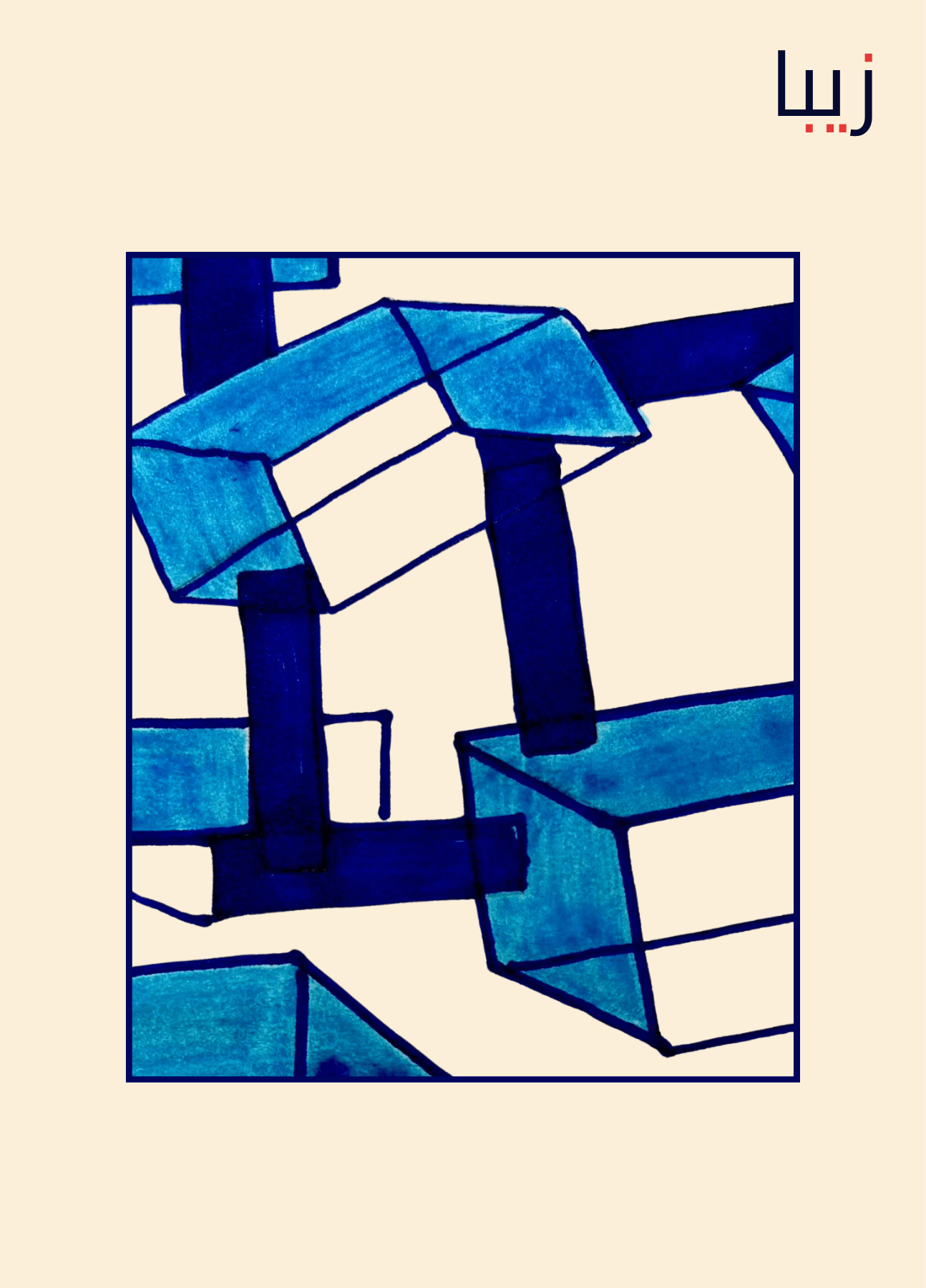
One of the most successful ways of generating intrigue in the audience is to make a cover minimalistic and abstract. Here at Zeba Books, we treat the covers as an important artistic decision and we try to balance the whimsy and seriousness accordingly. Our designs are often focused on the typography that highlights the contents of a book. Some the best minimalistic covers have been able to deliver that promise with just simple typography. It is in itself an art form, the placement of the text, the font, the colour, sometimes even the patterns or images that those fonts create; they are capable of compelling a reader to commit to a book.
To accompany the typography, Sana makes each of her designs on a canvas, with real colours and real human touch, giving them a bonus authenticity that is often missing from book covers. Recently, Sana has been working on poetry collections and classic reprints. The covers for poetry anthologies are made with open boundaries for interpretation, just like a poem itself. Collaboration, unsurprisingly, occupies a large part of the process. Before beginning a design, she discusses with the publisher exactly what message the cover should convey. Ideas and visual references are exchanged before concepts begin to take shape. Like any good promise, a cover is rarely born in isolation.