Writing about the aesthetics and structure of any international writing system can turn out to be both tedious and complicated. This is especially true in case of calligraphy. That said, in this article, we will attempt to briefly summarize some key concepts about Arabic and Urdu calligraphic forms.
Arabic and Urdu Calligraphy on the Web
Most of us share a good deal of familiarity with the Latin alphabet. However, the beauty of words knows and obeys no borders. There are several other writing systems out there — Arabic, Chinese, Indic, Hebrew, you name it — each with its distinct set of shapes and letterforms.
Overview
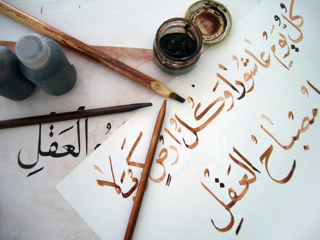
The Arabic/Urdu/Persian alphabet employs contextual shaping, that is, the shapes of letters change depending on their position in the word (as such, each letter has four forms: isolated, initial, medial and final).
In terms of calligraphic styles, the options are plenty. Here are some major ones (most such styles are distinguished as being either geometric or cursive):
- Kufic is a geometric style known for proportional measurements and angularity.
- Tuluth (literally, one-third) is known for its ornamental script and cursive letters.
- Ta’aliq (literally, hanging) is a style of Persian origin that uses cursive script and hanging-shaped letters.
- Diwani style was used by the Ottoman royal court. It is marked by complex lines within letters and the juxtaposed placement of letters within words.
- Naskh (literally, copy) is known for its clarity and is therefore often used to copy The Quran.
There are also specialized styles, such as Riq’aa (a conglomerate of Naskh and Tuluth) and Sini (a Chinese-Islamic calligraphy style). Furthermore, there are numerous other calligraphic “techniques” to speak of, such as zoomorphic in which words are manipulated in the shape of a human/bird/animal figure or object; Tughra which was used in royal seals of empires and kingdoms such as the Ottomans; Muthanna which embodies mirror writing such as composition on the left reflects that on the right; and Gulzar which uses ornamental/floral devices and other motifs.
However, the form that has the most usage is Nasta’liq, a Perso-Arabic script employed for writing Urdu in the South Asian region. The script is mostly cursive, with most of the letters in a word being connected to each other.
Shaping Words on Paper
Urdu calligraphy in Nasta’liq has had a great legacy in South Asia. In fact, the world famous Taj Mahal at Agra in India has a brass tablet with an inscription bearing the name of the calligrapher (compare this with the fact that the architect’s name is apparently nowhere to be found). Both Babur and Bahadur Shah II “Zafar”, the first and last Mughal Emperors respectively, were proven calligraphers.
It is a fairly obvious fact that as an expressive medium, calligraphy has the identity to convey both mood and identity. For students of subjects like Literature and History, calligraphy encompasses values beyond legibility and expression. Instead, it offers a legible value combined with aesthetic expression. To quote Nadine Chahine from ArabicType.com —
There is a moment in the life of every typeface, when the outlines come to life, when the letters, in Arabic at least, start to hold hands. Suddenly the pieces fit together and the energy starts to flow. It is a moment of pure uninhibited joy, a moment of design-infused euphoria when suddenly you are able to see with your own eyes the images that had occupied your thoughts for so long. Am so there right now and so not wanting to stop. But there is a train to catch, and all I want is to forget the whole world and just stay with my outlines.
But we know that paper isn’t everything nowadays.
The Impact of Technology
When it comes to digital typefaces and/or calligraphy, the hanging Nasta’liq script of Urdu is slowly being replaced by Naskh. The logic behind it is simple: as compared to Nasta’liq, Naskh renders well on digital devices — it is straight, angular, does not move vertically, and does not use too many dots to adhere to a strict pattern.
Since digital innovation almost always invariably favors functionality and utility, Nasta’liq seems to be losing the race. Most online Urdu publications, such as BBC Urdu or The Urdu Voice of America, use Naskh owing to its angular and straight pattern. Similarly, Facebook posts or tweets, as well as Urdu blogs, are all in Naskh. Of course, this does not make Nasta’liq puritans very happy.
It will still be an overstatement to claim that Naskh has become the de facto standard when it comes to writing Urdu on the internet. However, it surely has grown more popular than Nasta’liq, to say the least.
The Outcome
In spite of the linear clarity of Naskh, for all practical purposes, digital calligraphy can still be accomplished in Nasta’liq. The old school approach is to create one’s calligraphic lettering in an image editor, using paint tools, not text tools. This will free the calligrapher from reliance on typefaces and fonts, and one can easily create calligraphic images. Of course, ‘easily’ here is a subjective term: you still need to gain a good deal of mastery over the tablet/touchpad/mouse/whatever, and so on.
Conclusion
When it comes to Arabic/Urdu calligraphy, there are numerous variants in script, ranging from geometric to cursive to regular. Thus, much like East Asian languages such as Chinese or Japanese, the ‘one script per language’ rule does not apply here either.
The best part is that both Arabic and Urdu have good decorative aspect, which makes them perfect for typographic or calligraphic representation. Lastly, when experimenting with Arabic/Urdu typefaces on screen, there is ample room for creativity. For example, we can try rotated words, or use comparatively geometric or angular styles such as Kufic to replace ornamental ones, and so on.
When it comes to the written word, there exist no limits to innovation.
Featured Image: Aieman Khimji